Typography
A clear typographic hierarchy is critical to the effective communication of our brand. Type should be light and well-spaced to reinforce that we are transparent, open, and approachable. This system uses weight, scale, and capitalization to convey the relative importance of each heading within a document. Readability and accessibility allow all users to efficiently read and absorb textual information.
Typefaces View code
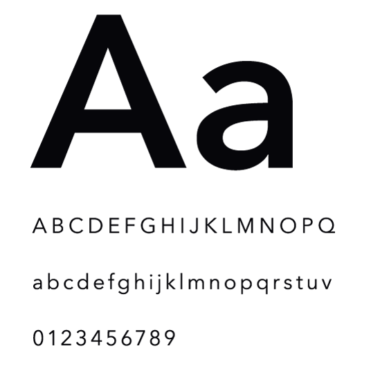
Avenir Next
Avenir Next is the primary brand typeface and can be used across all formats from print to digital. Its round and geometric letterforms are approachable and modern.
Avenir Next Demi Bold
ABCDEFGHIJKLMNOPQRSTUVWXYZ
abcdefghijklmnopqrstuvwxyz
0123456789
Avenir Next Medium
ABCDEFGHIJKLMNOPQRSTUVWXYZ
abcdefghijklmnopqrstuvwxyz
0123456789
Avenir Next Regular
ABCDEFGHIJKLMNOPQRSTUVWXYZ
abcdefghijklmnopqrstuvwxyz
0123456789
Web hierarchy
Hierarchy refers to the difference in type size and weight between text elements. It creates focus points that signal the user where to read. A successful hierarchy enables readers to easily scan content.
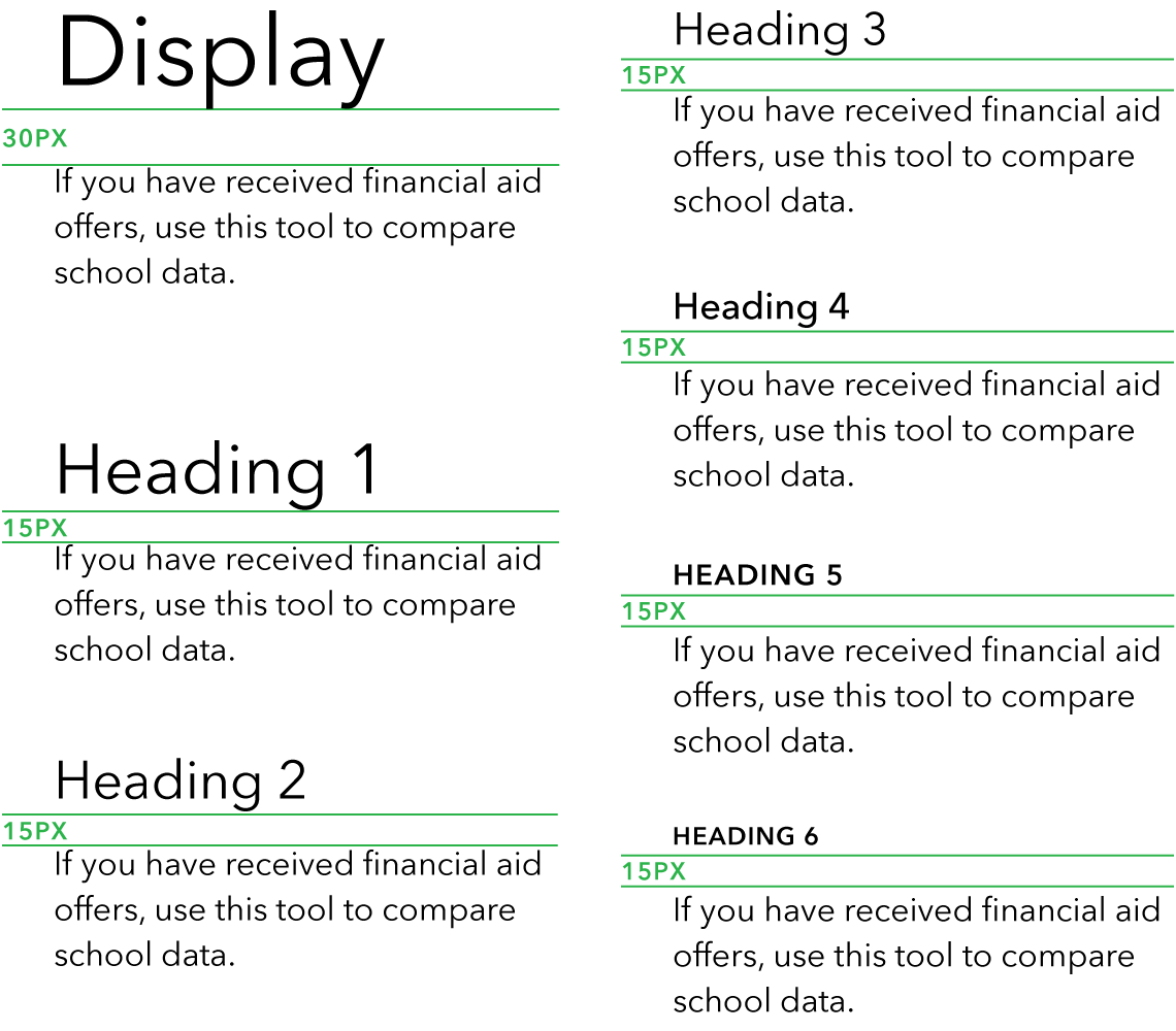
Headings
Consistent scaling, weights, and capitalization are used to create distinction between heading levels. They provide the user with a familiar focus point when they scan through text and it helps organize content. Headings are used in three weights of Avenir Next Demi Bold, Medium, and Regular.
Display
- Avenir Next Regular
- 48 px / 60 px
Getting out of debt
Heading 1
- Avenir Next Regular
- 34 px / 42 px
Getting out of debt
Heading 2
- Avenir Next Regular
- 26 px / 32 px
Getting out of debt
Heading 3
- Avenir Next Regular
- 22 px / 28 px
Getting out of debt
Heading 4
- Avenir Next Medium
- 18 px / 22 px
Getting out of debt
Heading 5
- Avenir Next Demi Bold
- 14 px / 18 px, 1 px letter spacing
- All caps
Getting out of debt
Heading 6
- Avenir Next Demi Bold
- 12 px / 15 px, 1 px letter spacing
- All caps
Getting out of debt
Body text
Body text should provide an efficient and pleasant experience on every viewport size. Readable text makes good use of alignment, spacing, line length and height, and contrast.
Lead paragraph
- Avenir Next Regular
- 22 px / 28 px line height
- Reduces to 18px / 22px line height on smaller screens
Use this tool to compare school data and relevant financial factors to make a more informed decision for your future.
Body
- Avenir Next Regular
- 16 px / 22 px line height
If you have received financial aid offers, use this tool to compare school data and relevant financial factors to make a more informed decision for your future.
Typesetting for readability
Readable text allows users to efficiently read and take in textual information. Text that is not readable turns off readers or makes it challenging for them to stay focused. The following guidelines promote good readability.
Alignment
Typography should be set flush left. This provides the eye a constant starting point for each line, making text easier to read.

Line height
Ample space between lines of type promotes an open feeling and lends flow to body copy.
When setting body copy, the leading should be 1.375 times the type size, or 37.5% larger.
Font size: 16 px

Line length
Comfortable line length allows the user’s eyes to flow easily from the end of one line to the beginning of the next.
For a single column of text, line length should be an average of 66 characters per line, including spaces, but may range from 50 to 75 characters.

Spacing
White space affects how the user focuses their attention on the content. It makes it easier to know what to read and where to begin. Spacing between typographic elements should be open enough to feel light, but close enough to establish a proper relationship between elements.
Heading followed by body copy
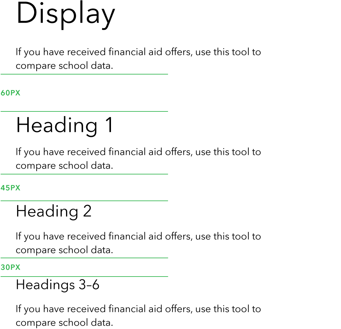
When a heading is followed by paragraph text, include 30 px of space below Display and 15 px below Headings 1–6.
Body copy followed by a heading
When body copy is followed by a heading, include 45 px of space above Heading 2 and 30 px above Headings 3–6.
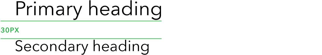
Heading followed by a heading
For stacked headings, include 30 px of space after the primary heading.
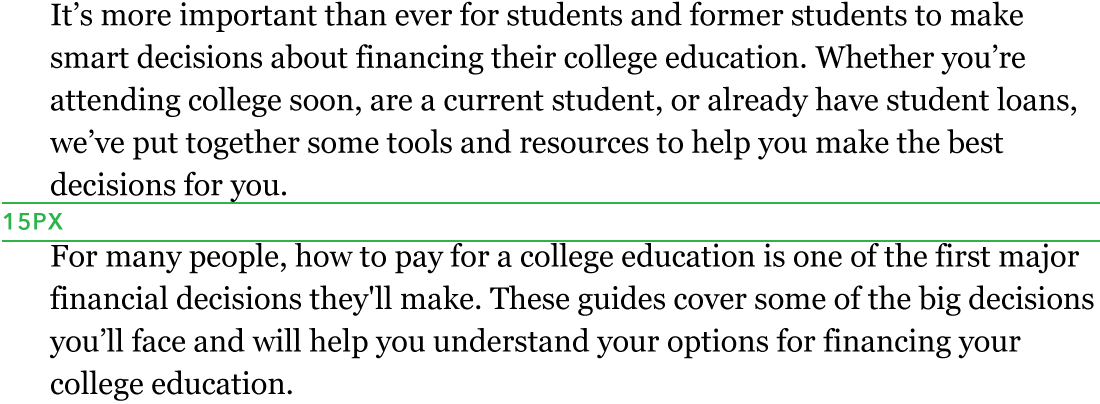
Body copy spacing
For multiple paragraphs within the same section set the space between paragraphs to 15 px.
Type accessibility
Text contrast
WCA (Web Content Accessibility) standards ensure that content is accessible by everyone, regardless of any disability or user device.
To ensure text remains compliant with WCAG 2.0 standards, use only these permitted color combinations. These options fall within the range of foreground/background color contrast permitted by the Section 508 guidelines.
For more information:
To learn more, refer to the http://www.section508.gov.
This color contrast tool is a useful resource for testing the compliance of any combination of colors in our palette.
Fully accessible combinations
Use only these accessible text and background color combinations.
- Black on White
- Dark Gray on White
- Gray on White
- White on Black
- White on Dark Gray
- White on Gray
- Black on Gray 10
- Black on Gray 5
- Pacific on Gray 5
- Black on Green 60
- Black on Green 20
Non-accessible combinations
Never set CFPB Green type on a white background or white type on CFPB Green background as these combinations are not accessible. Never set type on a patterned background.
- White on CFPB Green
- CFPB Green on White
Undesirable combinations
Although CFPB Green and black are accessible for large scale type, this color combination should never be used for web or print type.
- Black on CFPB Green
- CFPB Green on Black
Print hierarchy
This hierarchy should serve as a basis for 8.5 x 11” documents, but appropriate scaling should be explored for content of larger or smaller dimensions.
Headings
Consistent scaling, weights, and capitalization are used to create distinction between heading levels. They provide the user with a familiar focus point when they scan through text and it helps organize content. Headings are used in two weights of Avenir Next Demi Bold and Medium.
Display
- Avenir Next Medium
- 60 pt / 66 pt
Getting out of debt
Heading 1
- Avenir Next Regular
- 38 pt / 40 pt
Getting out of debt
Heading 2
- Avenir Next Regular
- 26 pt / 28 pt
Getting out of debt
Heading 3
- Avenir Next Demi Bold
- 16 pt / 18 pt
Getting out of debt
Heading 4
- Avenir Next Medium
- 14 pt / 16 pt
Getting out of debt
Heading 5
- Avenir Next Demi Bold
- 10 pt / 12 pt
- All caps
Getting out of debt
Heading 6
- Avenir Next Medium
- 12 pt / 14 pt
Getting out of debt
Body text
Subheading
- Avenir Next Regular
- 16 pt / 20 pt
Use this tool to compare school data and relevant financial factors to make a more informed decision for your future.
Paragraph
- Avenir Next Regular
- 11 pt / 16 pt
If you have received financial aid offers, use this tool to compare school data and relevant financial factors to make a more informed decision for your future. Evaluate the costs and risks involved in paying for school.
Bulleted list
- Avenir Next Regular
- 11 pt / 14 pt
-
Use this tool to compare school data and relevant financial factors to make a more informed decision for your future.
-
Evaluate the costs and risks involved in paying for school.
-
Use web school data and relevant financial factors to make a more informed decision for your future.